
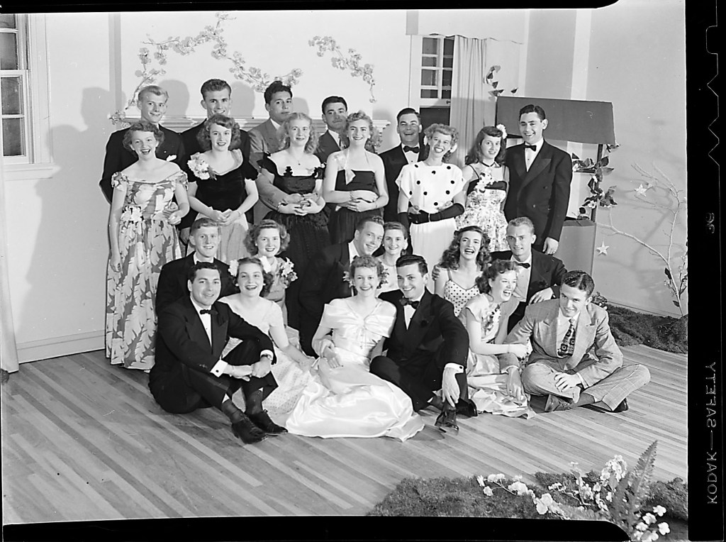
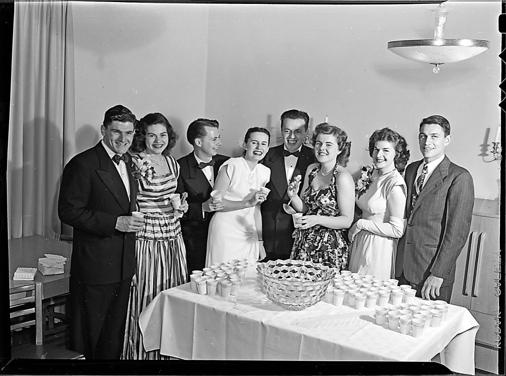
Joel photographed one of the social events of the Tau Kappa Kappa living community. There’s no specific date other than the expiration date for the box is labeled as July 1947. Verifying with images from Naranjado, I can confirm that, although the majority of faces line up with 1948 Tau Kappa Kappa images, some faces are also in the 1947 Tau Kappa Kappa Naranjado image line-up, the latter shouldn’t be a surprise.
And as anyone who has photographed a large group of people, it is pretty much impossible to have them all under control without an assistant policing the focus.
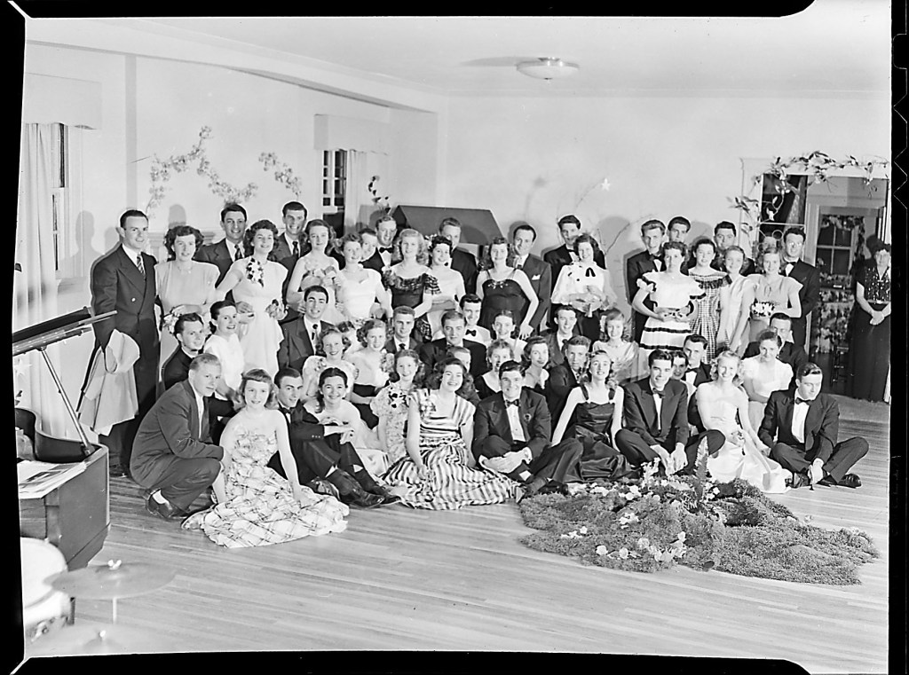
Joel is standing up for the above image and the camera is pointing down. This seldom yields a flattering perspective. The image below clearly demonstrates the difference, except there’s even less focus …
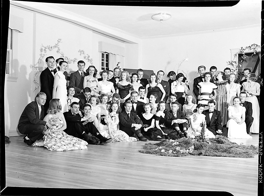
Ladies and gentlemen, focus, this is serious business for the photographer ! Nothing changed over all this time, last minute lipstick adjustments are still the norm.

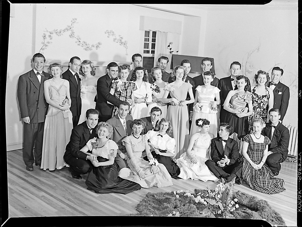

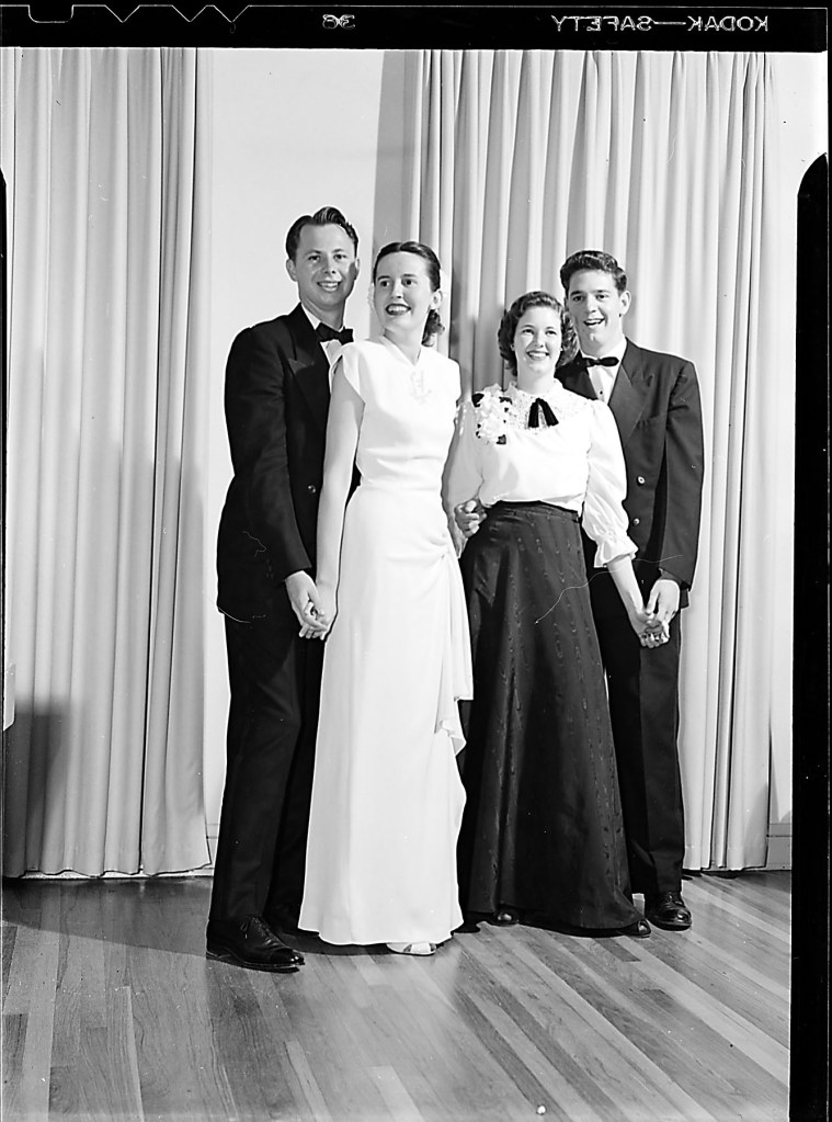
Joel took the time for the above image to shoot from a lower position, and it results in much less distortion of the body images. Technically speaking, the lens should be pointing horizontal and be at mid-body level for the least amount of perspective distortion. (Joan Wendels was the Tau Kappa Kappa Spring President for 1948)
The map images are nothing specific, it’s a historical map from Monterey Bay. I believe this was merely a comparison how different film stock renders the same subject under same conditions. As photographers, we’re guilty of learning this way. Demonstrated sharpness is the same regardless of film stock. The limit for sharpness is Joel’s lens.
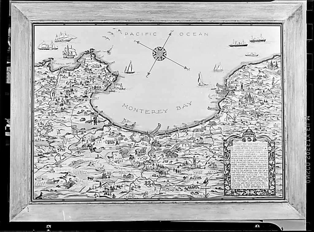
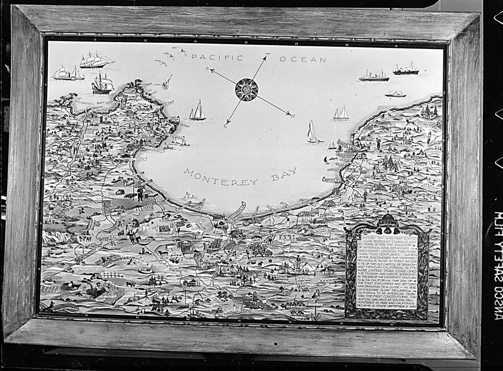
Out of the above, we notice Joel used in both cases Ansco film stock, but the notches in the film are different, pointing to a different emulsion behaviors.
The bottom negative is denser than the top negative, the difference between Panchromatic (wide spectrum sensitive) stock versus Orthochromatic (blue sensitive) stock. The latter renders red tones much darker than panchromatic film.
We’re closing out the 1947 negatives and slowly migrate to 1948.
Cheers !
